A New Visual Identity for Oslo Classics Festival
Identity, typography, website, content and print developed as one connected brand system.


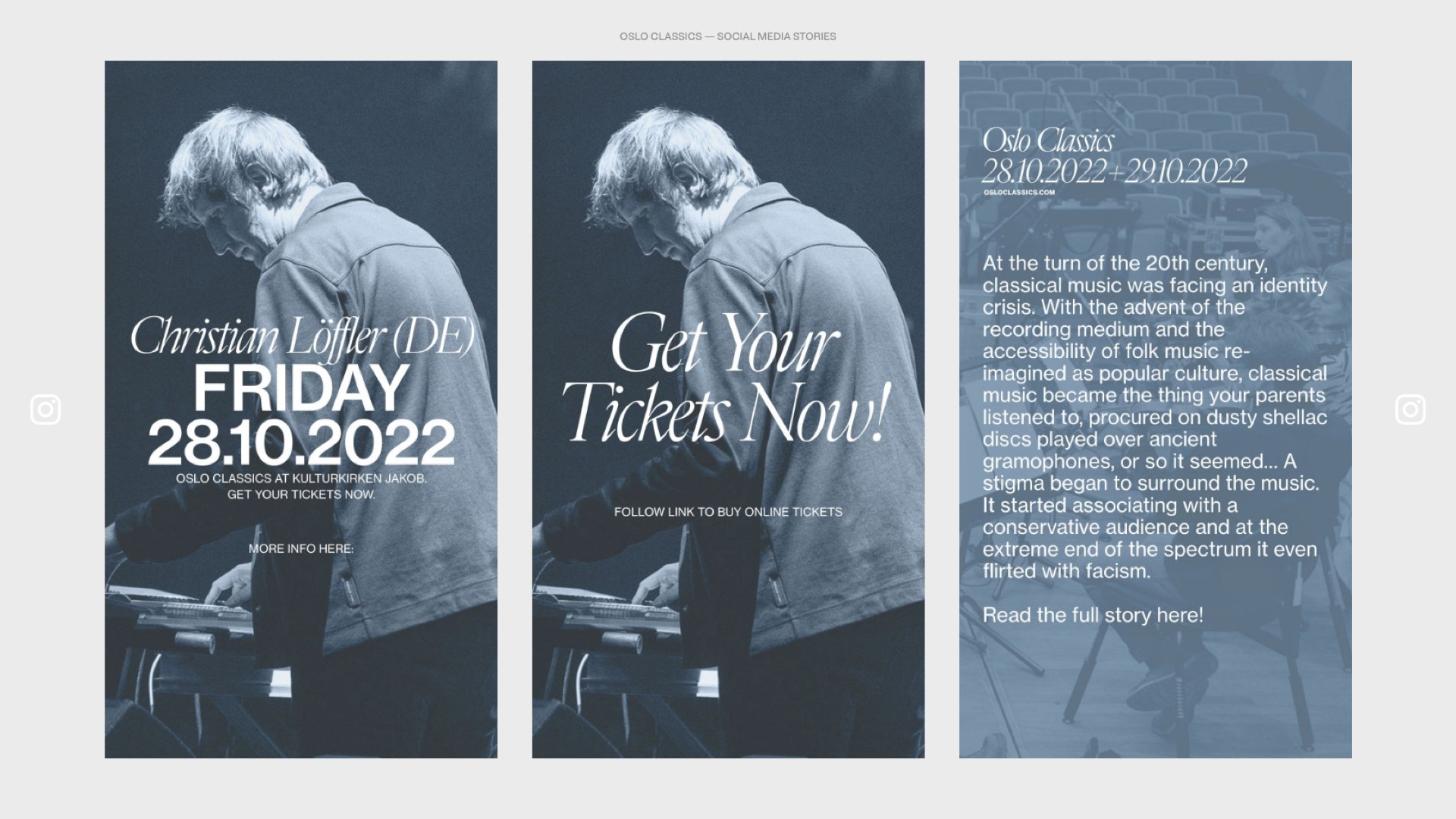

Oslo Classics Festival asked Sylte Studios to develop a new visual identity and carry it through the website, posters, printed programmes and ongoing communication. From April to October 2022, Alexander Sylte worked within the organisation as Brand and Image Director. The embedded role made it possible to respond as artists, dates and venues changed while keeping the visual language coherent across every release.
Classical music brings history, form and expectation. The identity needed to respect that context without making the festival feel institutional or closed. Typography became central to the solution. Cardinal Photo gives the festival a distinct editorial voice at display sizes, while Neue Haas Grotesk structures practical information such as performers, venues, dates and times. Together, they balance character with clarity across formats, down to eight-point text on printed flyers.
Festival communication happens in bursts. A concert is announced, a programme changes or a venue is added, and the information must move quickly across the website, posters, social channels and printed material. The system uses a fixed type scale, a consistent grid and clear rules for how text and images meet. New material could be produced from an established framework rather than designed again from the beginning.
The website was built in Squarespace with custom code and development where required. Its structure prioritises the questions audiences arrive with: who is performing, when and where the concert takes place and how to buy a ticket. Editorial pages give artists and programmes enough space to be read in greater depth.
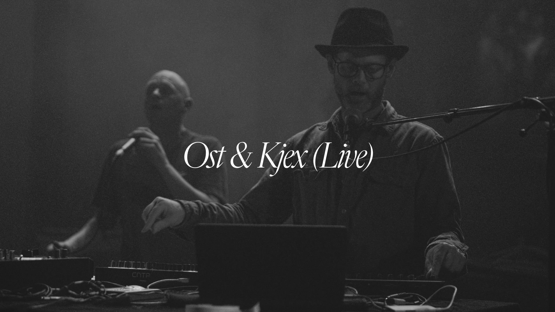
Photography was produced throughout the season alongside the design work. The festival’s own images became part of the identity, giving its artists, venues and concerts a consistent place within the system. Posters, flyers, programmes and social assets were developed as the programme evolved and published in the same months as the performances they announced.
Scope
— Brand strategy
— Creative direction
— Visual identity and typographic system
— Website architecture, design, and custom development
— Copy and messaging
— Poster design and print
— Photography and image direction
— Content production and social assets
Brand and Image Director, embedded: Alexander Sylte.